Bar Chart
The Bar Chart is used to display and compare different categories of data. The Bar Chart can work with the following aggregate functions: Count, Sum, Average, Min and Max.
Bar Chart Settings
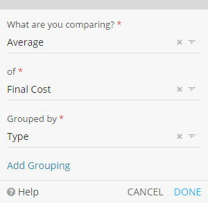
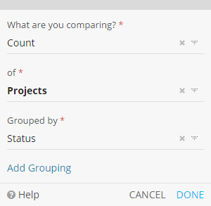
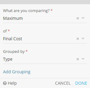
What are you comparing?


Grouping
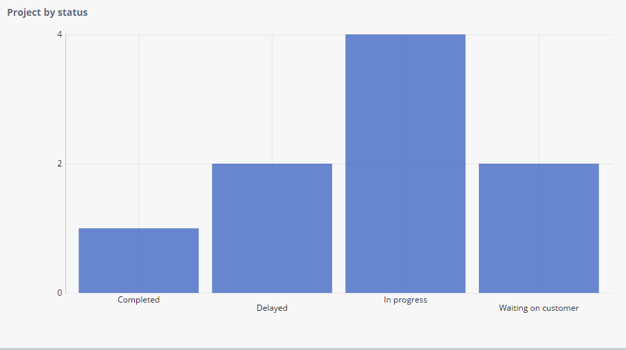
| Grouped by |
The Field used for grouping by record values plotted in the Bar Chart.
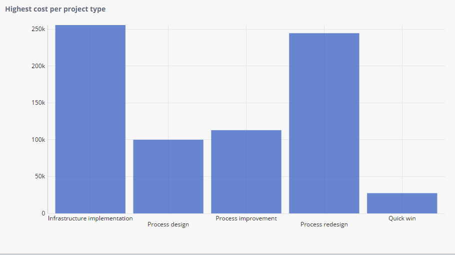
Configuration 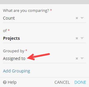
Result 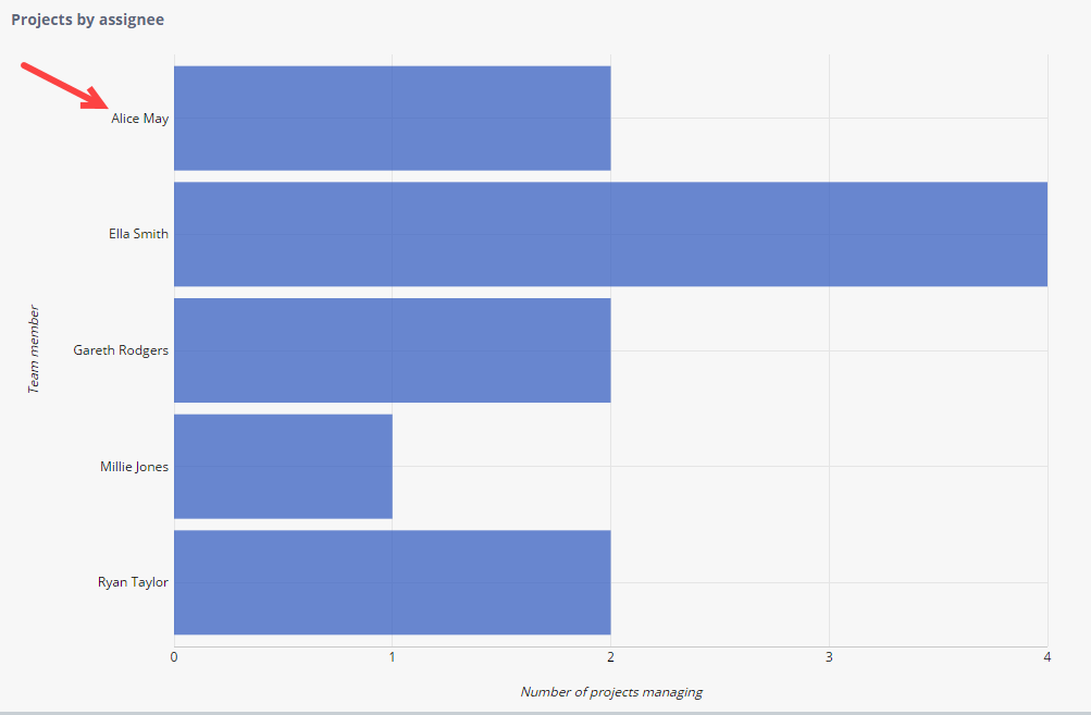
|
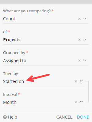
| Then by |
The Field used for adding an additional layer of grouping.
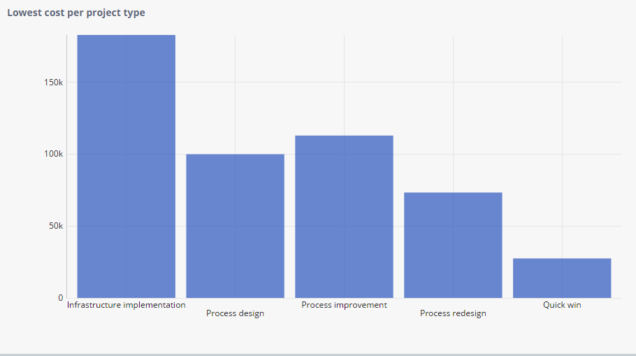
Configuration 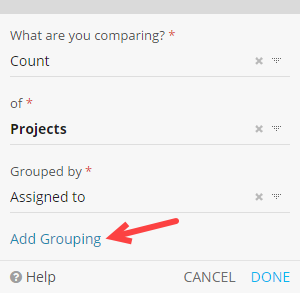
Result 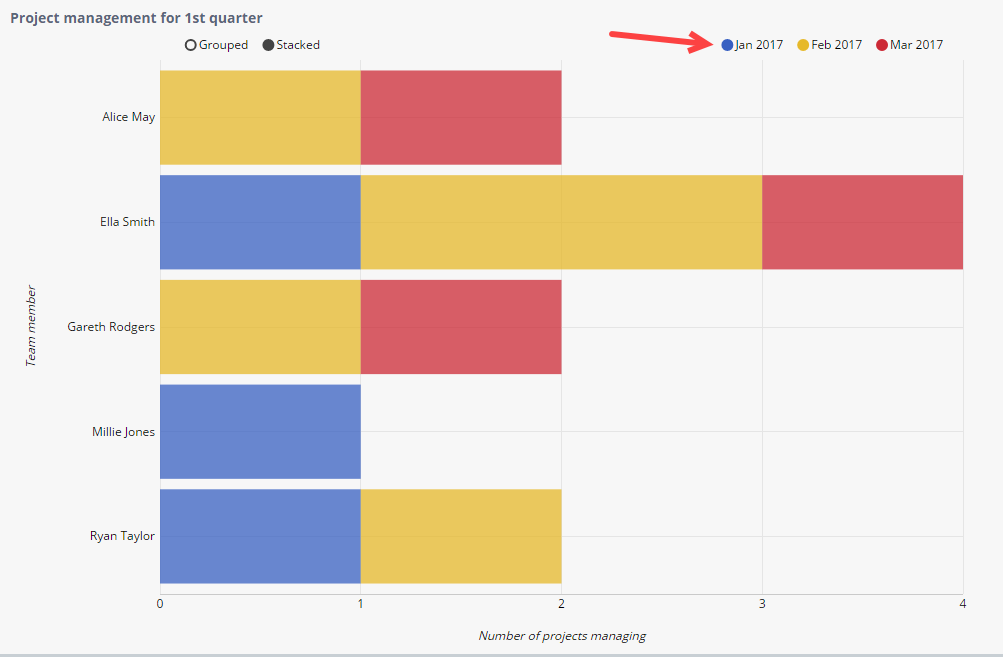
|
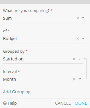
| (Interval) |
The interval is used for grouping by specific fragments of a date, such as the Year, Month or Day. Note: The Interval setting will only be available when the chosen Grouped By Field is a Date.
Configuration 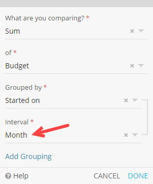
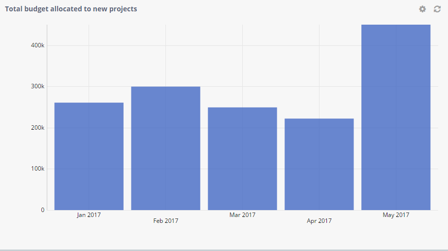
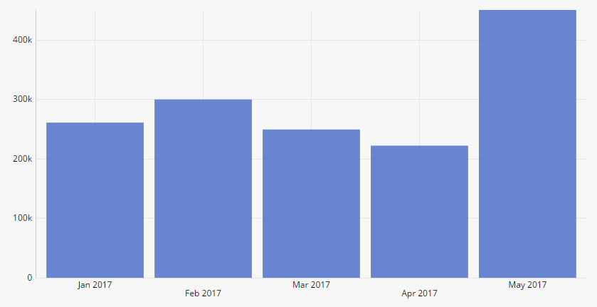
Result 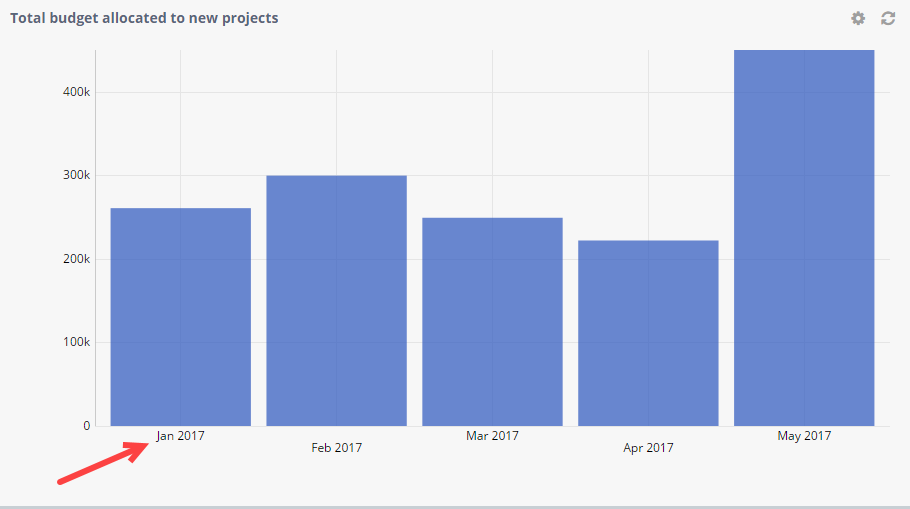
|
Bar Chart Formatting
Formatting lets you add additional styling options to the widget.
Orientation |
|
Vertical
|
Horizontal

|
Axis Labels |
|
|
You can add labels that decribe your axis. |
|
|
Configuration 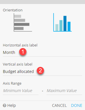
|
Result 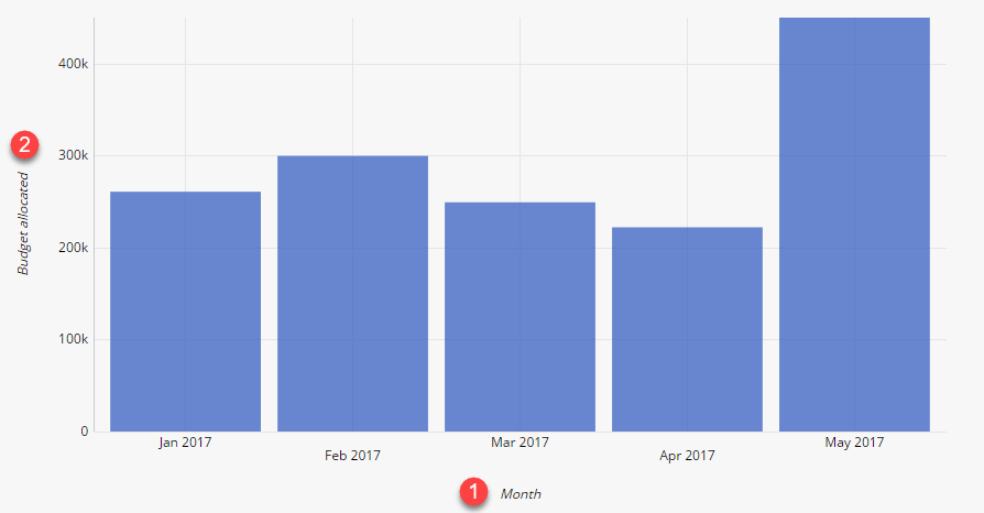
|
Axis Range |
|
|
You can set a minimum or maximum value for the Bar Chart's axis values. This can be used to visually enhance the difference between close data. |
|
|
Configuration 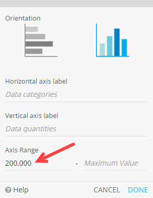
|
Result 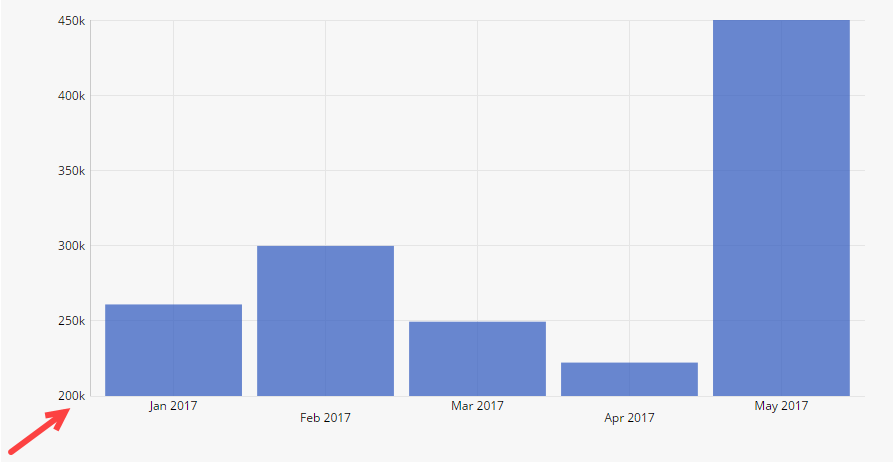
|
Bar Chart Filtering
You can apply two types of data filtering: widget filtering and saved views.
Widget filtering should be applied as a base filter.
For example, you might want a Bar Chart widget to only take in consideration the Projects assigned to the logged in user, as shown below:
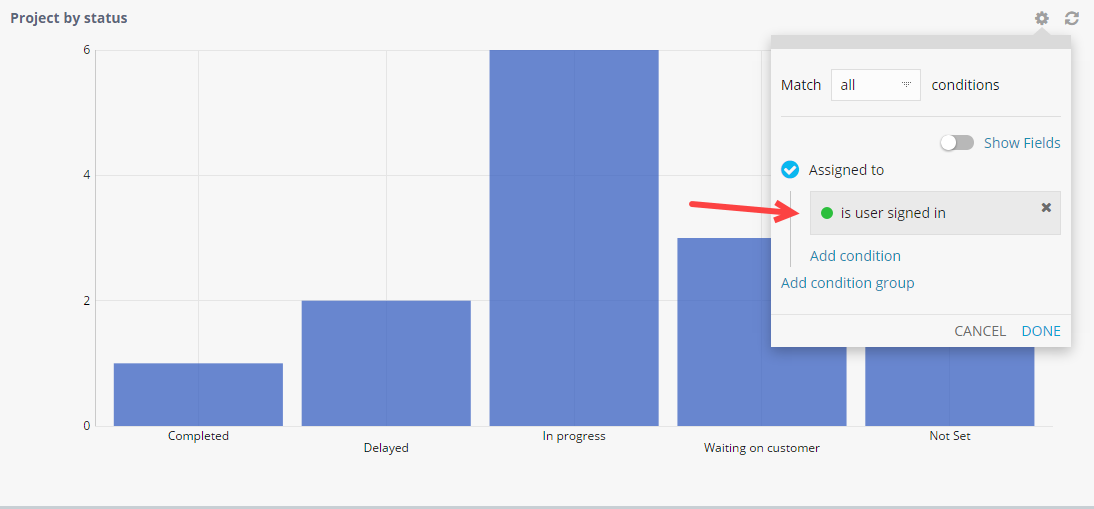
Note: Widget filtering will be applied to all users.
Saved views can then be applied on the whole dashboard (unlike widget filters, that are applied per widget) and you can, for example, show only ongoing Projects, as shown below:
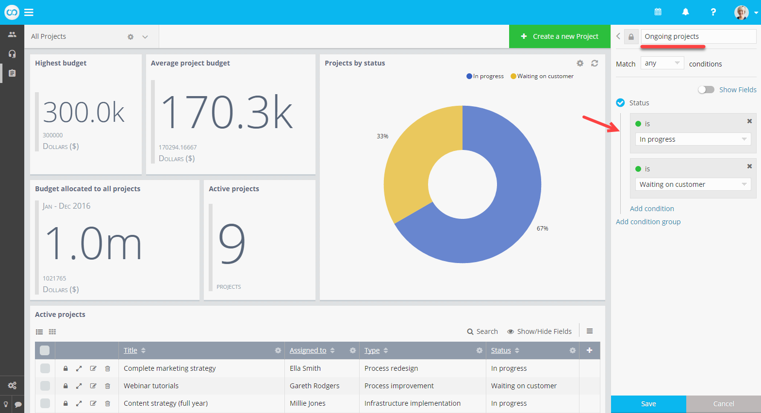
Note: Saved views are applied on top of widget filters. Unlike widget filtering, saved views are only applied to the user in context. You can share them with other team members.